Emergency Nursing 2022: Branded Graphics
Role: Creative Director
Live Event • Brand Experience • Experiential Design
Live Event • Brand Experience • Experiential Design
Design of the overall show look for Emergency Nursing 2022
ENA’s annual conference held in Denver, Colorado
ENA’s annual conference held in Denver, Colorado
The visual identity for Emergency Nursing 2022 was shaped by early exploratory questions shared with the planning committee, board, and core internal team. Rather than starting with a predetermined theme, the design direction emerged from listening to what emergency nurses were carrying into this moment.
Across responses, several themes consistently surfaced:
• A deep desire to be together again after years of isolation
• The emotional weight of everything emergency nurses had experienced
• The need for healing, connection, and renewed energy
• A shared sentiment: “Your ENA family has your back”
• A deep desire to be together again after years of isolation
• The emotional weight of everything emergency nurses had experienced
• The need for healing, connection, and renewed energy
• A shared sentiment: “Your ENA family has your back”
EN22 became an opportunity to visually express joy as a form of care; joy in reunion, joy in shared laughter, joy in the profession itself.
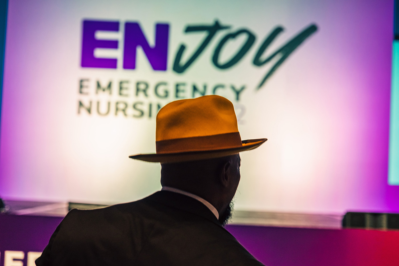
Theme Development: ENJoy
From those insights, the 2022 theme ENJoy was developed; combining “EN” (Emergency Nursing) with joy as an intentional emotional outcome.
ENJoy reflects multiple layers of meaning:
• The joy of being together again
• The energy of in-person connection
• The vibrancy of shared experience
• A reminder that emergency nurses deserve moments of joy, not just endurance
• The joy of being together again
• The energy of in-person connection
• The vibrancy of shared experience
• A reminder that emergency nurses deserve moments of joy, not just endurance
The theme informed every design decision, from typography and color to environmental graphics and digital touchpoints.
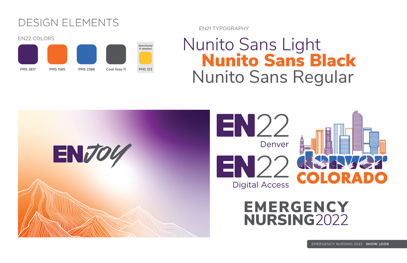
Color System & Visual Language
The EN22 color palette was built entirely from ENA brand guidelines, with a deliberate emphasis on ENA purple and orange.
• Purple anchors the system in trust, stability, and institutional continuity
• Orange was intentionally selected for its associations with joy, warmth, encouragement, health, and optimism
• Orange was intentionally selected for its associations with joy, warmth, encouragement, health, and optimism
Together, the palette evokes the feeling of a mountain sunset, directly tying the brand to Denver while reinforcing the emotional tone of the conference.
Supporting neutrals and directional accents were used strategically to ensure clarity across large-scale structures, print materials, and digital platforms.
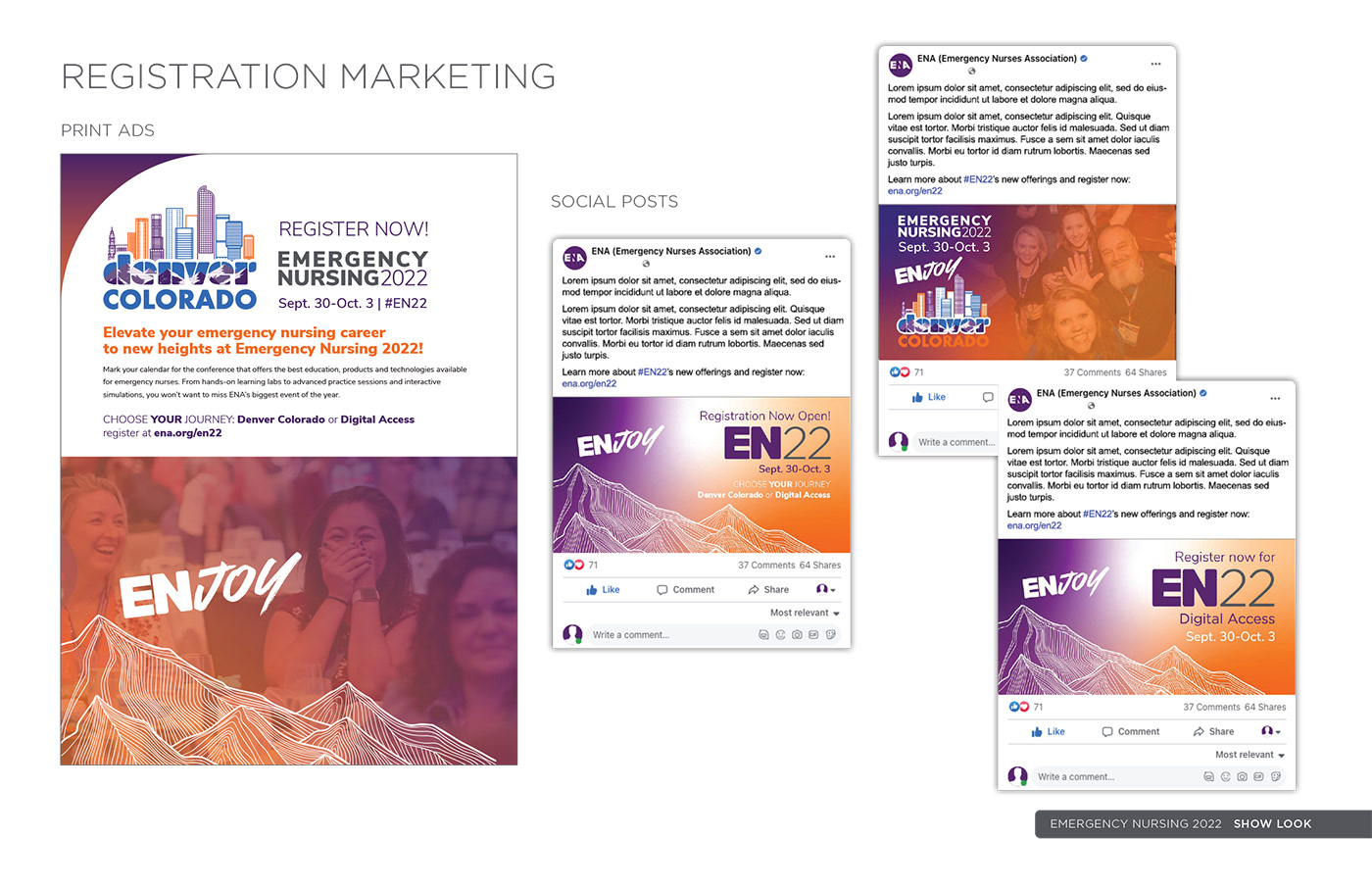


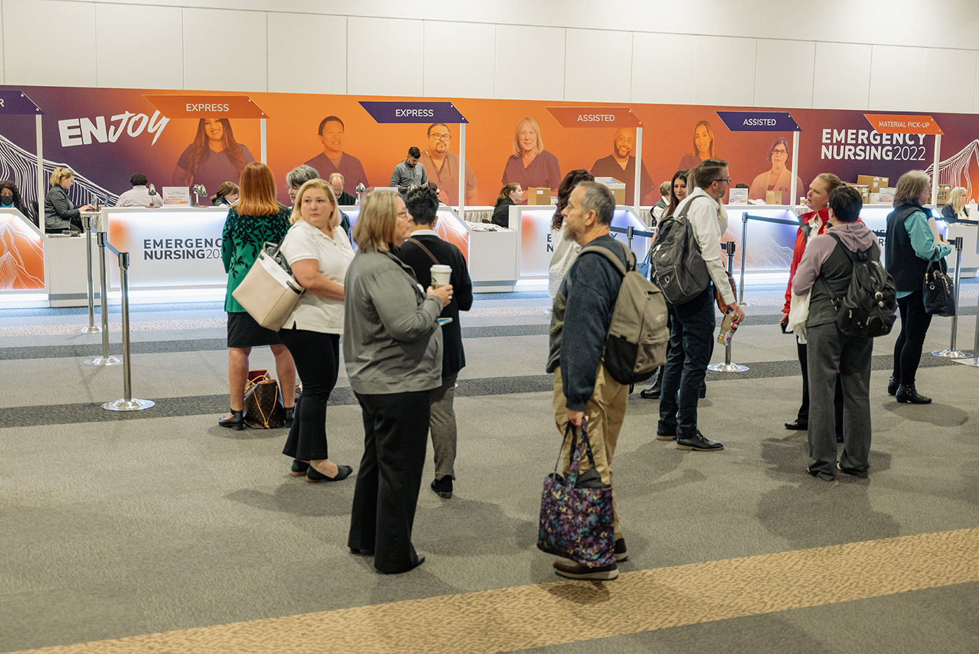
Feedback from early exploratory questions also highlighted how meaningful it was for members to see themselves and their peers reflected throughout the conference experience.
This insight influenced:
• The integration of member imagery across conference structures
• The inclusion of faces and moments that felt authentic, human, and relatable
• A design approach that centered the community, not abstractions
• The integration of member imagery across conference structures
• The inclusion of faces and moments that felt authentic, human, and relatable
• A design approach that centered the community, not abstractions
The result was a show look that felt lived-in and personal, reinforcing belonging rather than spectacle.
The EN22 show look was not designed to impress from a distance, but to meet people where they were; emotionally, professionally, and collectively; and to reflect that back to them through every visual choice.
I write more about this approach to listening and experience design in my Substack post, Listening to the Room.